
The Net Promoter Score is the metric that reaches a slide fastest. One question, one number, one arrow pointing up. That speed is exactly the problem: in most small companies the number is statistically incapable of showing what it is meant to show. It moves more than any improvement you could realistically achieve. Let us look at what the score measures, how many responses it needs, why its own inventor added to it, what has changed in 2026, and what a survey looks like when an action actually follows from it.
What does NPS actually measure?
The calculation is simple. One question on a scale from 0 to 10, usually "How likely are you to recommend us?". Anyone answering 9 or 10 counts as a promoter, 7 and 8 as passives, 0 to 6 as detractors. The Net Promoter Score is the percentage of promoters minus the percentage of detractors. Passives drop out of the calculation entirely. The metric was popularised in 2003 by Fred Reichheld in the Harvard Business Review under the title "The One Number You Need to Grow".
That title is also the point of contention. In 2007, Timothy Keiningham, Bruce Cooil, Tor Wallin Andreassen and Lerzan Aksoy published a longitudinal study in the Journal of Marketing covering 21 firms and more than 15,500 interviews from the Norwegian Customer Satisfaction Barometer. They replicated Reichheld's approach and could not confirm his claim of a "clear superiority" over other satisfaction measures. The paper won the Marketing Science Institute's H. Paul Root Award for it. So NPS correlates well with other satisfaction measures. It simply is not better than them.
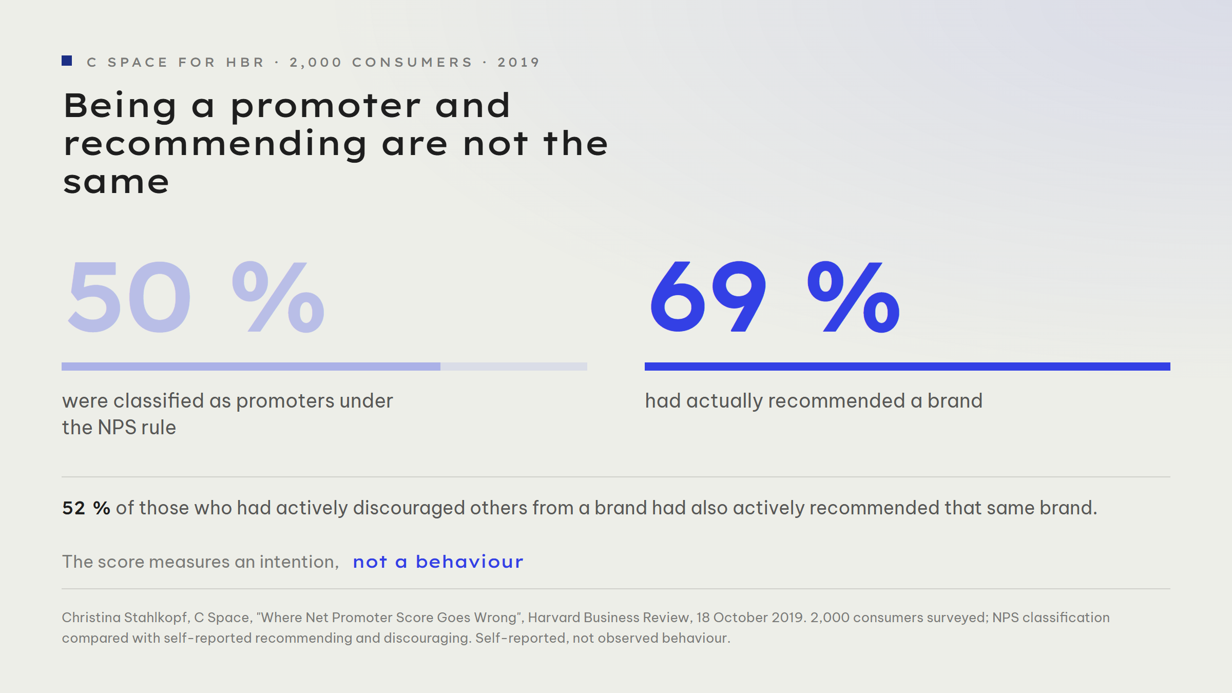
The second limitation is behavioural. In 2019, Christina Stahlkopf of the agency C Space compared the NPS classification of 2,000 consumers with their actual behaviour in the Harvard Business Review. Her finding, verbatim: "50 per cent of customers in our survey were promoters, but 69 per cent of customers had actually recommended a brand." And the more uncomfortable one: "52 per cent of all people who actively discouraged others from using a brand had also actively recommended it." The score asks about an intention. Recommending and warning off, however, are not camps. They are situations.
How many responses does your number need?
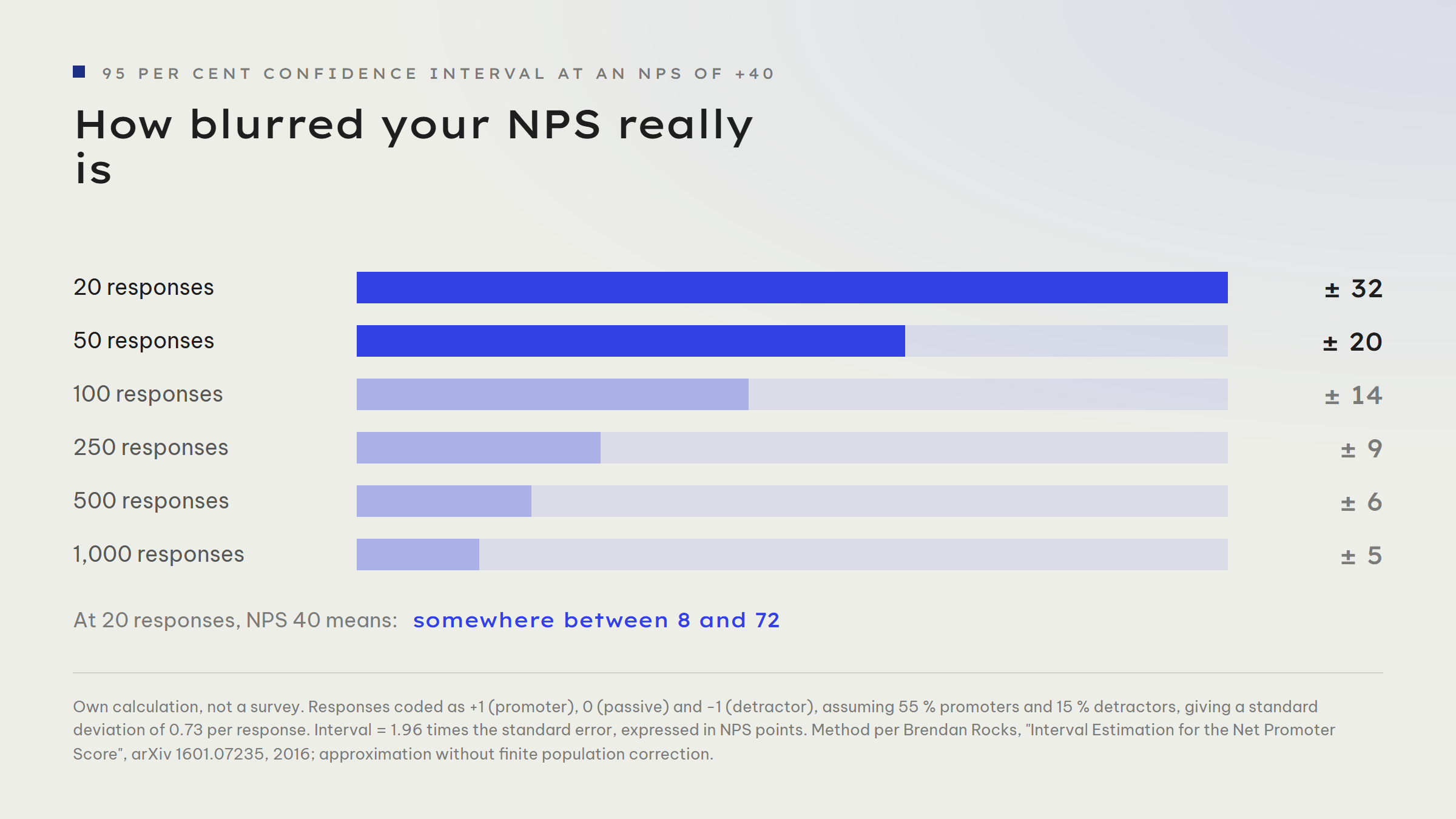
Here is the point that genuinely affects small companies, and it is almost never worked out. NPS is a mean: each response counts as +1, 0 or -1. That makes the spread easy to determine, and a confidence interval follows from it. In 2016, Brendan Rocks noted something remarkable in "Interval Estimation for the Net Promoter Score": "While adoption of the statistic has grown rapidly over the last decade, there has been little published on its statistical properties." A metric written into bonus targets worldwide had barely been examined statistically.
Work it out for your own case. With 55 per cent promoters and 15 per cent detractors the NPS sits at +40. The standard deviation of a single response is then roughly 0.73. At 20 responses that gives a 95 per cent interval of about plus/minus 32 points. Your "NPS 40" is therefore anything between 8 and 72. At 50 responses it is still plus/minus 20 points, at 100 responses plus/minus 14.
What follows in practice? If you have 300 customers and 40 respond, a move from 35 to 45 between two quarters is not progress, it is noise. Anyone interpreting that movement is building measures on chance. NPS is not worthless, but it is a metric for organisations with many similar customer contacts. For a service business running 40 projects a year it is decoration. The same applies to any conversion rate calculated from two dozen cases.
Why did the inventor revise it himself?
In 2021, Reichheld followed up with Darci Darnell and Maureen Burns in "Net Promoter 3.0". The piece is interesting because it does not deflect the criticism, it states it. It describes how firms tied the score to bonuses, "which made them care more about their scores than about learning to better serve customers", and how the score was then collected: by pleading ("I'll lose my job if you don't rate me a 10"), by bribery ("we'll give you free oil changes for a 10") and by omission ("we never send surveys to customers whose claim was denied"). His verdict: some firms had turned the score into a "vanity statistic".
The proposed repair is the genuinely useful part for small companies. Reichheld sets an accounting figure against the survey: Earned Growth. Growth is split by whether a customer returned or was referred ("earned") or bought because of advertising, a discount or sales pressure ("bought"). It is less comfortable to collect and, in exchange, impossible to manipulate, because it comes from your invoices rather than a questionnaire. Anyone wanting to know whether referrals really carry the business counts them in the CRM instead of asking about them. A single mandatory field when a contact is created is enough: where did this contact come from?
What is new in 2026?
One development is currently undermining the value of external survey data at the root. In November 2025, Sean Westwood of Dartmouth described an autonomous synthetic respondent in the Proceedings of the National Academy of Sciences: an AI agent driven by a 500-word prompt that fills in questionnaires, sustains an assigned demographic profile and remembers its earlier answers. Across 6,000 trials it passed 99.8 per cent of the standard attention checks panels use to filter out automated responses. Cost according to the study: around five cents per response. In seven major US polls before the 2024 election, between 10 and 52 injected responses would have been enough to flip the predicted outcome. The paper received the 2025 Cozzarelli Prize from PNAS.
Westwood's conclusion describes the problem precisely: the founding assumption of survey research, that a coherent response is a human response, is no longer tenable. For you as a business this has a surprisingly good side. What is affected is mainly anonymous panels and open online surveys. You know your own customers by name, and every response comes attached to an invoice, a project and a contact history. Precisely this first-party data is gaining value while bought market data blurs. That advantage only materialises, though, if you attach the answer to the customer instead of collecting it anonymously.
What should you ask instead?
The survey that works for a small company looks nothing like the quarterly dashboard. It consists of two sentences and a phone call.
The first sentence is a scale question, so you can sort at all. Use the NPS question by all means, but treat it as a filter rather than a metric. When the subject is a single transaction rather than the relationship, the Customer Effort Score is the better question: it asks about effort rather than delight, and lands exactly where customers drop out. The second sentence is the open follow-up, and that is where the entire return sits: "What was the main reason for your rating?" Free-text answers are workable at 40 responses, a mean is not. Ten free-text answers in which the same friction appears three times are a solid finding. An NPS from those same ten responses is not.
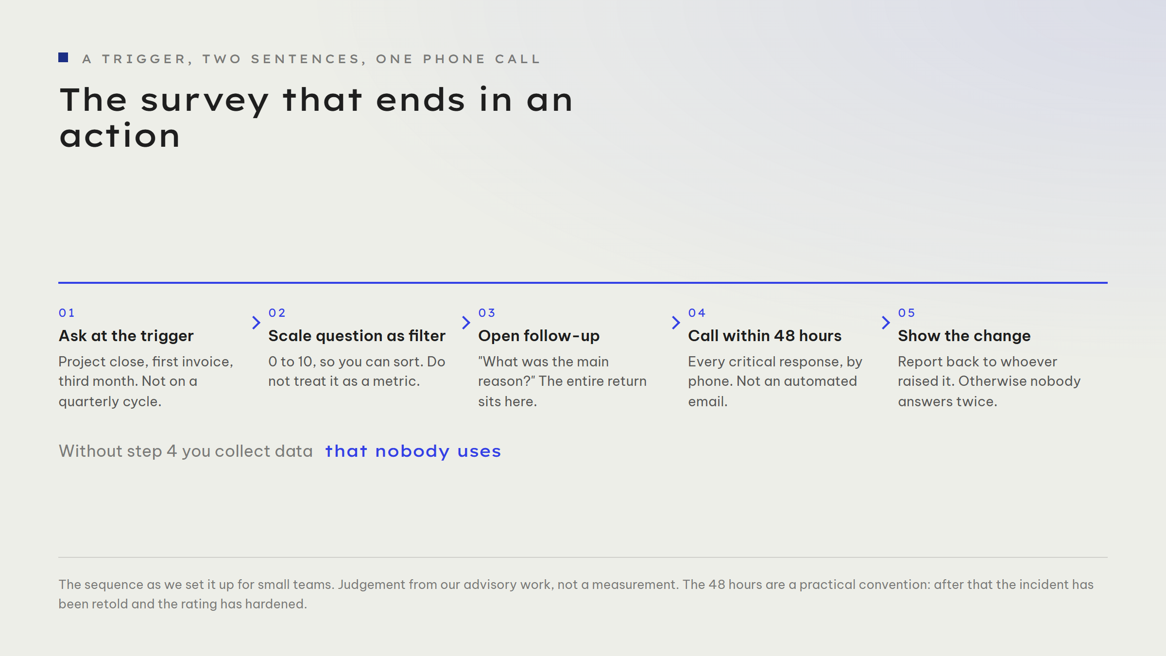
The phone call is the part almost everyone leaves out, and the only one that earns money. The term for it is closed-loop feedback: every critical response triggers a call within 48 hours, not an automated email. This is not a service gesture, it is data collection: only in conversation do you find out whether the poor rating is about your work, about an expectation set in the sales process, or about a misunderstanding. Three such calls tell you more about your churn rate than three quarters of score.
On timing: ask at a trigger, not on a calendar cycle. After project completion, after the first invoice, after the third month of working together. Those moments already sit in your customer journey, and the response rate there is many times higher than for a round-robin email to the whole list. If you want clean separation, ask about segments too: a score averaged across all customer groups flattens out exactly the differences you were asking about.
Three levers for this week
Lever 1: work out your confidence interval before you interpret your next score. Take your number of responses and check whether the movement between two waves even sits outside the noise. Below 100 responses the answer is almost always no, and that is a valuable finding: you save yourself a measure that reacts to chance.
Lever 2: introduce a mandatory "where did this contact come from?" field. Five options, filled in by sales when a contact is created, not by the customer. After six months you know which share of your growth was earned and which was bought. That number is less comfortable than a score and nobody can talk it up.
Lever 3: call the next three critical responses personally. Within 48 hours, without justifying yourself, with a single question: what should have gone differently? Write the answers down verbatim. If one sentence repeats, you have your finding, and it is the one no metric carries.
If you would like your survey checked from the outside: we look at whom you ask, when you ask, and whether your numbers actually carry what you derive from them. Book a slot, half an hour is enough for a first verdict. 📋